Before I ever studied minimalism as a principle, I felt it.
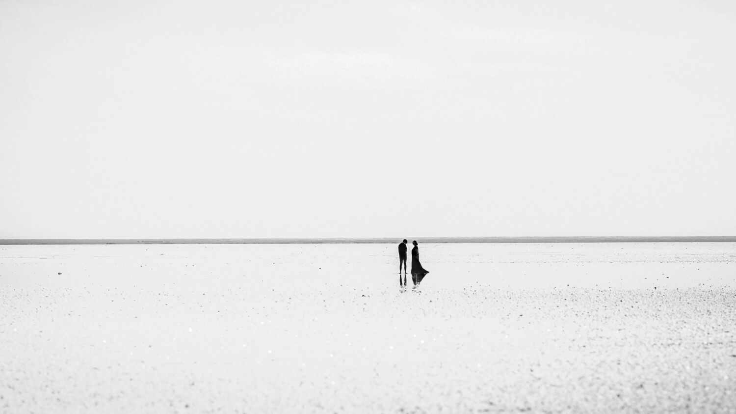
It was not in a classroom or a gallery, but in a quiet Scandinavian room washed with morning light. There was a chair, a table, a single vase. That was all. Yet something about that stillness felt complete, almost sacred.
It was my first encounter with presence. I did not know the word “minimalism” yet, but I knew the feeling: the peace that comes when nothing more is needed.
I. The Origins of Stillness
Minimalism did not begin as a style. It began as a way of seeing.
In the 20th century, artists like Donald Judd, Agnes Martin, and Frank Stella began stripping away ornamentation until only essence remained. Their work was not about decoration, but about truth.
Architecture followed suit with Ludwig Mies van der Rohe, who turned structure into poetry. His “less is more” wasn’t a slogan—it was a form of meditation.
Long before them, the East had already whispered these truths.
Zen spoke of emptiness as fullness. Taoism taught harmony through restraint. Wabi-sabi saw beauty in imperfection and silence.
Minimalism, I now believe, is neither Western nor Eastern—it is human. It is the longing for clarity amidst chaos.
II. The Art of Focus
We live in a world that never stops talking. Every screen blinks for attention. Every design screams for recognition.
Minimalism is the art of learning to whisper again.
When I design, I often think of Apple. Every interface, every box, every margin of white is intentional. Their silence speaks louder than slogans. The discipline of that simplicity is not aesthetic—it is moral.
To remove the unnecessary is to trust that what remains is enough.
III. Time as Design Material
Minimalism is not about now. It is about always.
Muji understands this. Their objects do not age because they never belonged to a trend. No logos, no embellishment—just quiet utility and lasting grace.
The paradox is beautiful: when you stop chasing relevance, you become timeless.
A minimalist object doesn’t shout to be seen—it waits to be noticed.
IV. The Discipline of Purpose
Minimalism demands honesty.
I think of the Barcelona Chair—every line deliberate, every material justified. It does not seduce; it stands with quiet confidence.
The same truth lives in the Google search bar. One box. One purpose. Nothing more.
Minimalism, when practiced with integrity, is generosity. It gives you back your attention, your breath, your time.
V. The Ethics of Less
Minimalism is not just design—it is conscience.
Patagonia builds this philosophy into every stitch. Fewer garments, better made. Less marketing, more meaning. Their simplicity is activism disguised as elegance.
Even architecture learns from this ethic. When you remove walls, light enters. When you design with restraint, nature becomes your collaborator.
Minimalism teaches responsibility through beauty.
VI. The Geometry of Emotion
Every time I enter a minimalist space, I feel it—calm, clarity, expansion.
In Scandinavian interiors, light becomes a material. Space becomes emotion. Nothing feels missing; everything breathes.
In branding, too, minimalism becomes instinct. The Nike Swoosh is a single gesture, yet it holds universes: speed, ambition, motion, memory.
Simplicity, I’ve learned, is the purest form of power.
VII. Lessons I Carry
Minimalism taught me how to listen.
In my studio, every project begins with subtraction.
Each color must earn its place.
Each word must hold weight.
Whitespace is not emptiness—it’s grace.
Minimalism is not about less. It’s about clarity.
Not about coldness, but honesty.
Not about perfection, but presence.
Sometimes, late at night, I think back to that room where it all began—the light, the silence, the vase.
Minimalism, I’ve realized, is not the opposite of abundance. It is the doorway to meaning.
To design minimally is to live deliberately.
To live deliberately is to see clearly.
And when you see clearly, what remains is always beautiful.
ABSOLUTEARTT®
Beyond form, into meaning.


