Layout design is more than arranging text and images. It is the architecture of perception, a subtle framework that shapes how information is seen, read, and remembered. A well-crafted layout transforms content from mere words and visuals into an experience that feels intuitive, deliberate, and engaging.
Understand Your Audience
Every design begins with empathy. Who will read this content? What do they notice first? What holds their attention? Knowing your audience informs every choice — font size, color palette, spacing, and visual rhythm. A professional magazine might favor precise grids and restrained typography, while a creative portfolio may embrace bold visuals and playful asymmetry. Understanding these nuances turns design from decoration into communication.
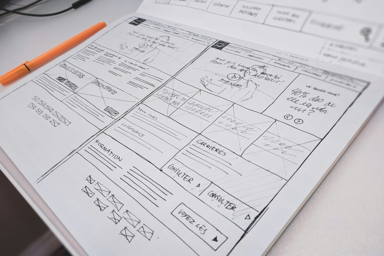
Establish Hierarchy and Flow
Hierarchy is the language of clarity. It tells the reader what to look at first, what comes next, and where to pause. Headlines, subheads, and bullet points create rhythm, while scale, weight, and contrast guide the eye. Grids and alignment systems provide invisible structure, allowing creativity to express itself within order. A good layout moves the reader naturally, making the experience feel effortless.
Typography That Speaks
Typography is the voice of the page. Choose fonts that match tone and context — serif for tradition and authority, sans-serif for clarity and modernity, or expressive display fonts for personality. Spacing, kerning, and contrast ensure readability, while subtle emphasis highlights meaning without overwhelming. Typography shapes not just what is read, but how it is felt.
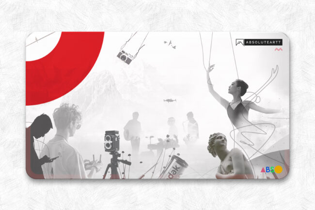
Integrate Visuals Thoughtfully
Images, icons, and illustrations are not ornaments; they are instruments of storytelling. Each visual should reinforce the content, break monotony, and guide attention. Composition, alignment, and style must complement the typography, while white space ensures clarity and focus. The right visual can transform a paragraph into a memorable idea.
Harness White Space
Whitespace is the silent partner in every design. It creates breathing room, balances elements, and highlights priority content. Thoughtful spacing allows the eye to move freely and the mind to absorb information naturally. In layout, silence is as powerful as the elements themselves.
Design for Multiple Screens
Layouts no longer live on paper alone. Every composition must adapt to devices of all sizes. Flexible grids, scalable typography, and responsive visuals ensure that whether viewed on a phone, tablet, or monitor, the content remains clear and impactful. Designing with adaptability in mind is no longer optional — it is essential.
Iterate, Observe, Refine
No layout is perfect on the first attempt. Observe how readers engage, gather feedback, and refine. Small adjustments — a margin shift, a typeweight change, a repositioned visual — can transform comprehension and flow. Design is iterative; it evolves with every insight, every observation.
The rhythm of a layout, the balance of space, the voice of type, and the dialogue between text and image — all of these combine into an experience that feels invisible, yet unmistakably present. When design guides without forcing, clarifies without constraining, and lets content breathe, it becomes more than structure. It becomes a conversation, a subtle orchestration of thought, attention, and perception.